



If there’s one fiction author that can get my data nerd juices flowing, it’s Neal Stephenson. Ever since I first read Neal’s Cryptonomicon — years ago — I was utterly captivated by his ability to weave mundane, everyday data into narrative, but it wasn’t until third (or was it fourth?) read-through that I finally decided to test one of the stray thoughts from there.
The book’s protagonist Lawrence Waterhouse — mathematician, wartime codebreaker, and a man who can’t stop himself from reverse-engineering the world — looks through the window of a train at English countryside with “subtly swelling emerald green fields strewn randomly with small white capsules that he takes to be sheep,” and wonders:
Of course, their distribution is probably not random at all—it probably reflects local variations in soil chemistry producing grass that the sheep find more or less desirable. From aerial reconnaissance, the Germans could draw up a map of British soil chemistry based upon analysis of sheep distribution.
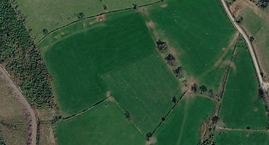
There’s logic in the assumption, and it’s nearly right — just not quite in the way Waterhouse pictures it. Sheep don’t wander Britain sniffing out their favorite soil. They’re fenced into fields, and inside a field the ground is much the same, so where a each given sheep stands is mostly about who it’s friends with and its own private OCD, not the soil.
What changes from region to region is how many sheep a farmer keeps — and that’s a question of economics, not preference. You drop sheep where they thrive and earn their keep in meat and wool (unless you’ve bought Jeremy Clarkson’s Easycare sheep, which shed their own fleece and bring in no wool at all); you thin them out where they’d struggle.
Soil decides what grows, what grows decides whether sheep pay, and the farmer decides the rest. So sheep density really is a readout of the ground — just with a human in the loop that the protagonist failed to factor in. The only way to figure out whether the hunch was right is to check if it’s backed by data.
It’s one of the oldest moves in data visualization: if you can’t see the variable you care about, you map a visible proxy and reconstruct it. Think amount of nighttime lights for economic activity, lichen for pollution, or, in case of Stephenson’s Cryptonomicon, grazing animals for soil quality.
The issue here, though, is that unfortunately you can’t photograph soil pH from a Dornier at 20,000 feet, but you can surely count sheep. So I counted them, the modern way — two open datasets, both global models built by different teams from different inputs:
Sheep: the FAO’s Gridded Livestock of the World, which spreads agricultural-census sheep counts onto a roughly 10 km grid.
Soil pH: ISRIC’s SoilGrids, a modelled topsoil surface for the whole planet.
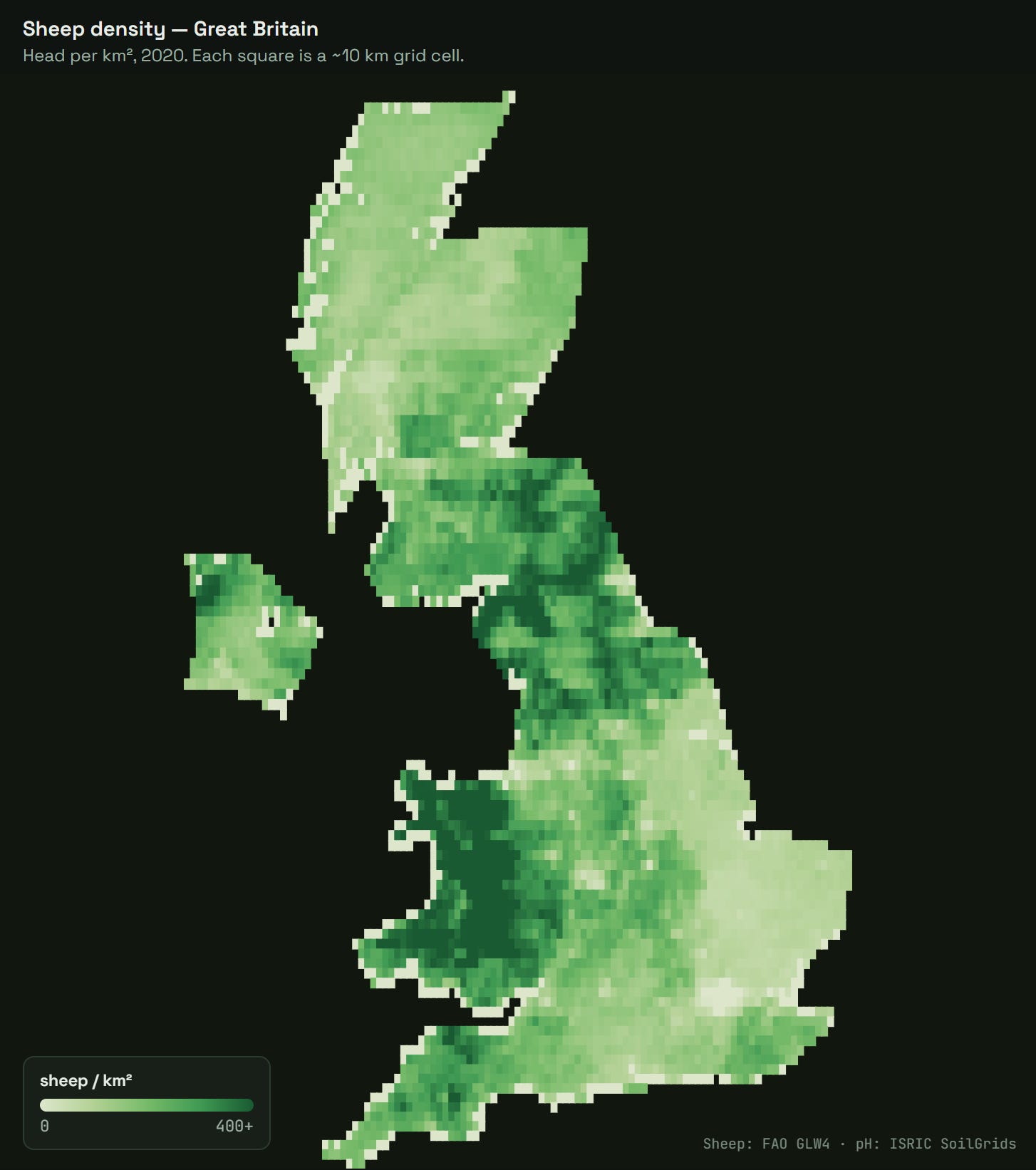
I clipped both to Great Britain, averaged the fine-grained soil pH into each sheep cell, and ended up with 4,779 little squares, each one carrying a sheep density and a soil acidity. Here’s the first, the one Waterhouse could see from his train window.
And here’s the thing they couldn’t photograph, the soil underneath.
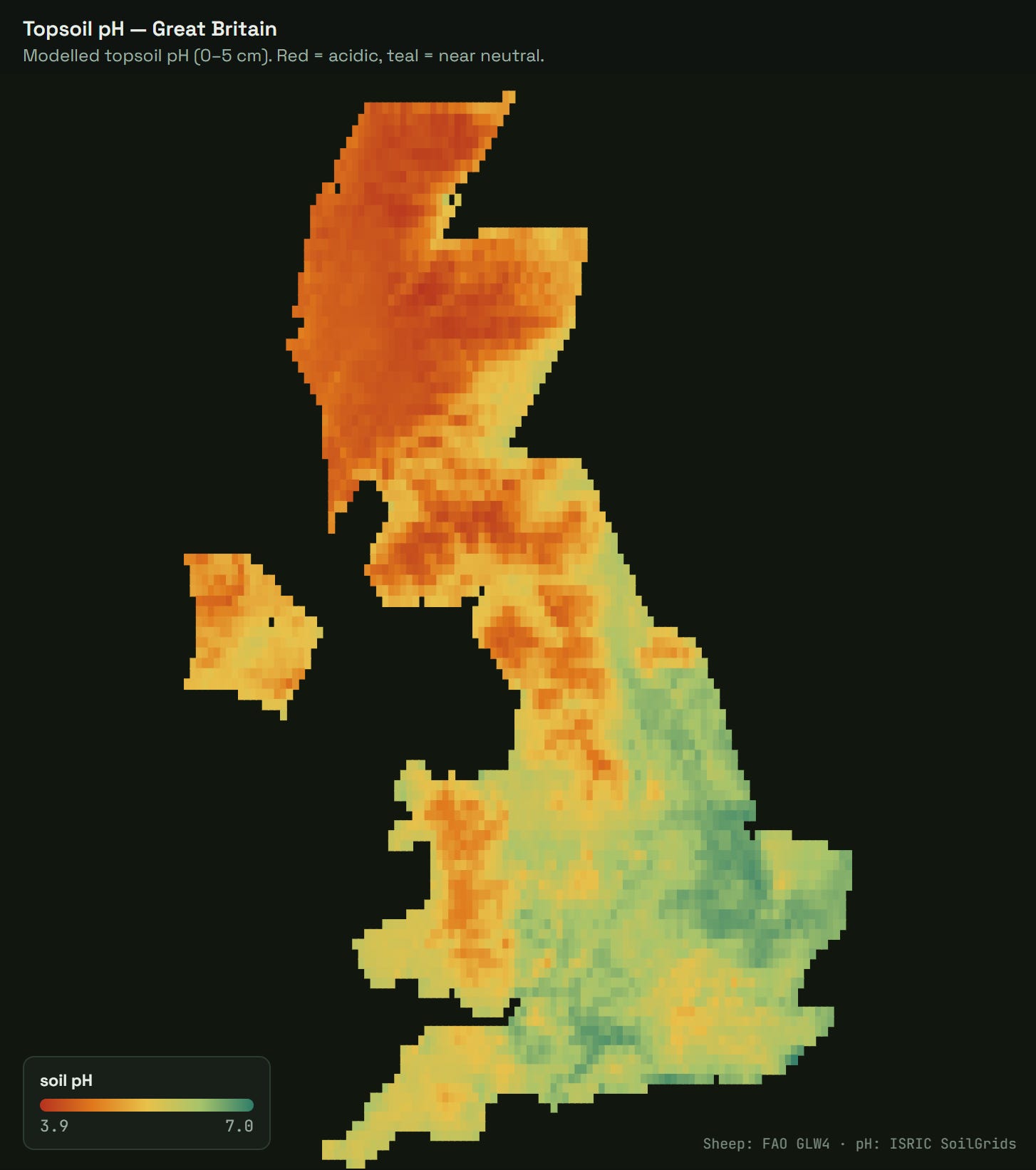
Put those two side by side and the hunch mostly holds: the deep-green sheep country is the red acidic country. Wales, the Pennines, the Southern Uplands — red on one map, green on the other — while the near-neutral lowlands of East Anglia and the southeast carry hardly a sheep. Hand a stranger the sheep map and they’d guess the soil map’s broad strokes.
Mostly, because one exception jumps straight out: the far north of Scotland is the reddest, most acidic ground on either map, and almost bare of sheep. That’s not just the soil talking. Barely anyone lives up there, and the few who do are distilling scotch, not running flocks. It’s an outlier, influenced by human activity (or lack of), not the quality of topsoil. For consistency, I decided to leave it in anyway — even if I pulled the entire Highland north out of the analysis, it would not make a dent in the results — there is just too few sheep there to move the needle.
Examining the numbers
Two maps that look alike is an impression, not a result. To pin it down, I put every patch of Britain on one chart. Each of the 4,779 cells becomes a dot: soil acidity along the bottom, number of sheep up the side. If the hunch is right, dots on the acidic side should sit higher. So, do the two actually move together?
The standard way to answer is to draw the single best-fitting straight line through the cloud and see how tightly the dots hug it. Here the line comes out nearly flat and the dots scatter miles off it. Score it and you get 0.3% — the line accounts for basically none of the ups and downs. Verdict: unrelated.
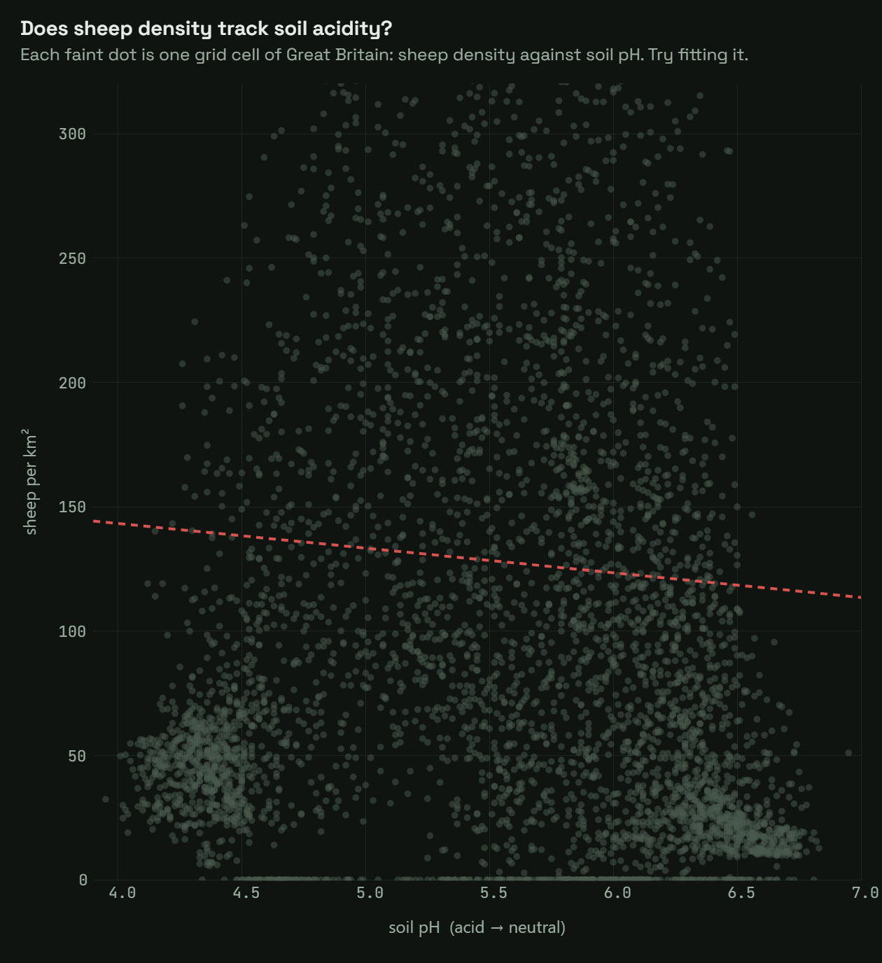
And in practice that verdict sticks, because you’re rarely looking at one pair of columns. You’ve got hundreds, you let the software fit a line to every pairing and rank them by that score, and you never draw the picture. This pair scores nothing and gets thrown out. Which is the mistake — because the dots aren’t random. They rise toward the middle and fall off at both ends. That’s a real pattern, it just isn’t a straight one, which can only tell you whether more acidity goes with steadily more/less sheep, flattening out the pattern that climbs and drops. No good.
So instead of forcing a line through the dots, let’s group them. Sort the 4,779 patches into narrow bands of soil acidity and, for each band, take the average number of sheep. That’s the gold line below — one point per band, the typical sheep density at that pH (an average, not a median). Strung together, the averages make a clear hump: sheep pile up around pH 5.4 and thin out toward both the sourest and the sweetest soils. Let the fit bend to follow that hump and it now explains about 20% of the dataset — same dots, dramatically more signal.
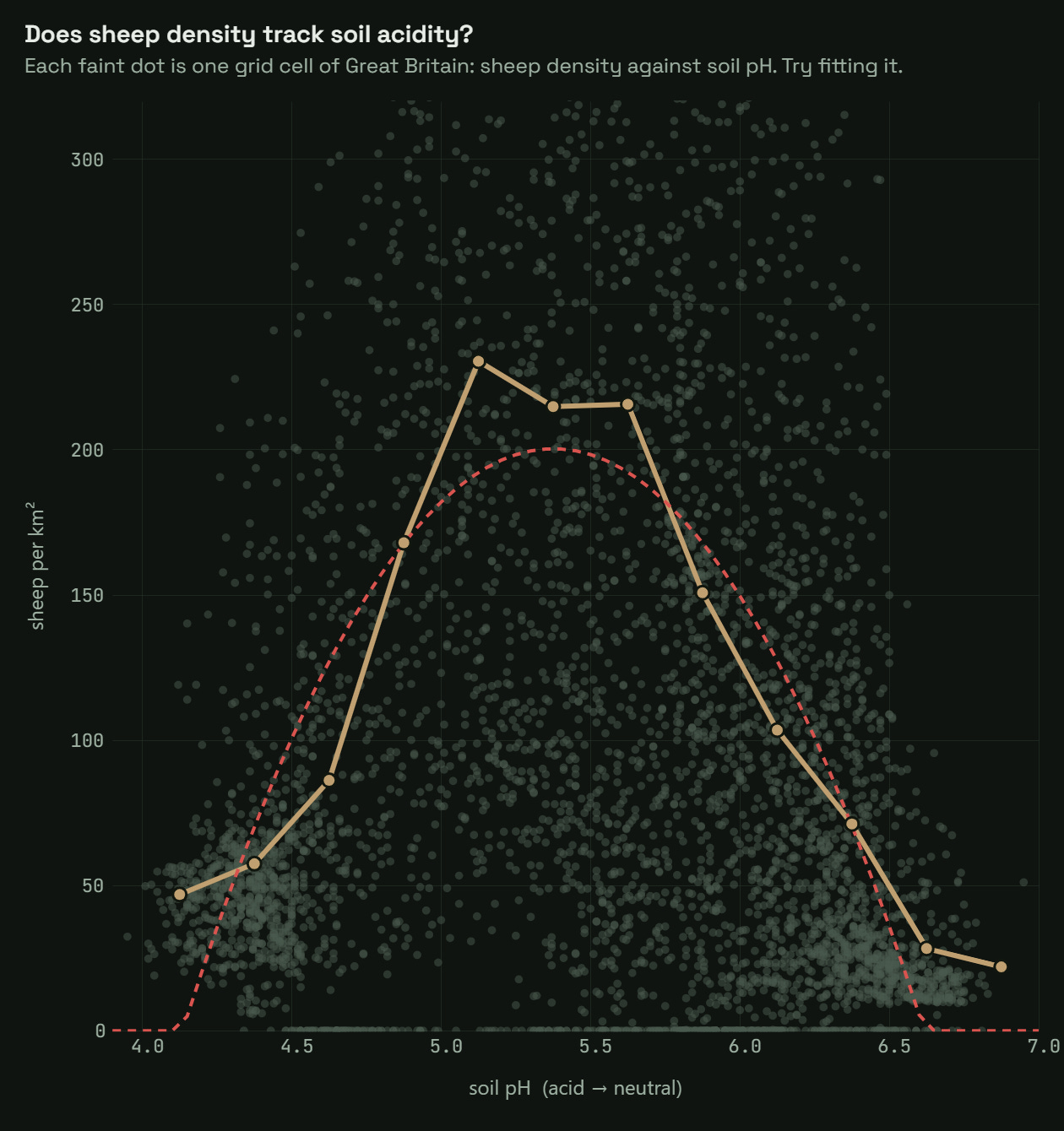
pH 5.4 — the zone of the sheep pileup.
And here is where it finally clicks, starts to make sense, and the signal we were looking for emerges. That’s the lesson: almost no correlation is not the same as no connection. Most patterns that get missed aren’t bad data — they’re real signals nobody bothered to draw.
Takeaways
The peak sitting at pH 5.4 does not mean that sheep like this specific acidity to the point of willing to relocate. It’s rather explained by the geography itself:
Below about pH 4.5 is blanket peat bog and the deep uplands: too sour and waterlogged even for hill sheep.
Around pH 5 to 5.5 is acid upland rough grazing: Wales, the Pennines, the Southern Uplands. Poor soil by a farming standards, but it grows the tough grasses sheep tolerate, and it’s no good for anything more profitable. This is sheep country, and it’s the top of the hump.
Above about pH 6.5 is fertile, near-neutral lowland. And that’s the problem, from a sheep’s point of view: land this good gets ploughed for crops or grazed by more valuable cattle, with the sheep getting the backseat.
So the map isn’t tracking “more acid” or “less acid.” It’s tracking a narrow Goldilocks band: soil bad enough to be cheap, but not to the point that it would not grow anything. That’s what using straight lines makes us miss — the sweet spot of the pattern.
Waterhouse had the right instinct — he saw a seemingly random scatter plot but sensed the potential of a pattern. Turns out, he was right — sheep really are a readable map of the soil when you really look at it.
Thank you for reading!
DataViz Dojo was created by amCharts team. We’re not here to peddle you our data-viz lib. We’re here to have fun with facts, data, cartography, and history, blending it all into beautiful visual stories. Subscribe, follow, or simply check in regularly for more compelling stuff!