



A chart is a Christmas Tree
When we set out to visually display data, the instinct tells us to make the chart as informative as possible, and thus we aim to decorate it like some kind of a digital Christmas Tree.
We need axes for, you know, the scale and reference. Complete with titles, units, labels, ticks, grid lines.
We need some kind of a legend — to identify series or display a heatmap scale.
There should be a title. Always a title in bold 32pt font.
A table of source data. References. Scrollbars. Zoom buttons. Cross-haired cursors. Tooltips. A myriad of other bells and whistles.
The actual data becomes just one of the ingredients in a pot of visual chowder.
A chart with no numbers
Making his “Warming Stripes” visual, Ed Hawkins — Professor of climate science at the University of Reading — went the totally opposite way: he stripped all the noise clean.
No axes, labels, legends. Just pure, distilled data.
Instead of making the the chart unusable, it made the trend behind the data scream loud: Global Warming Is Real.
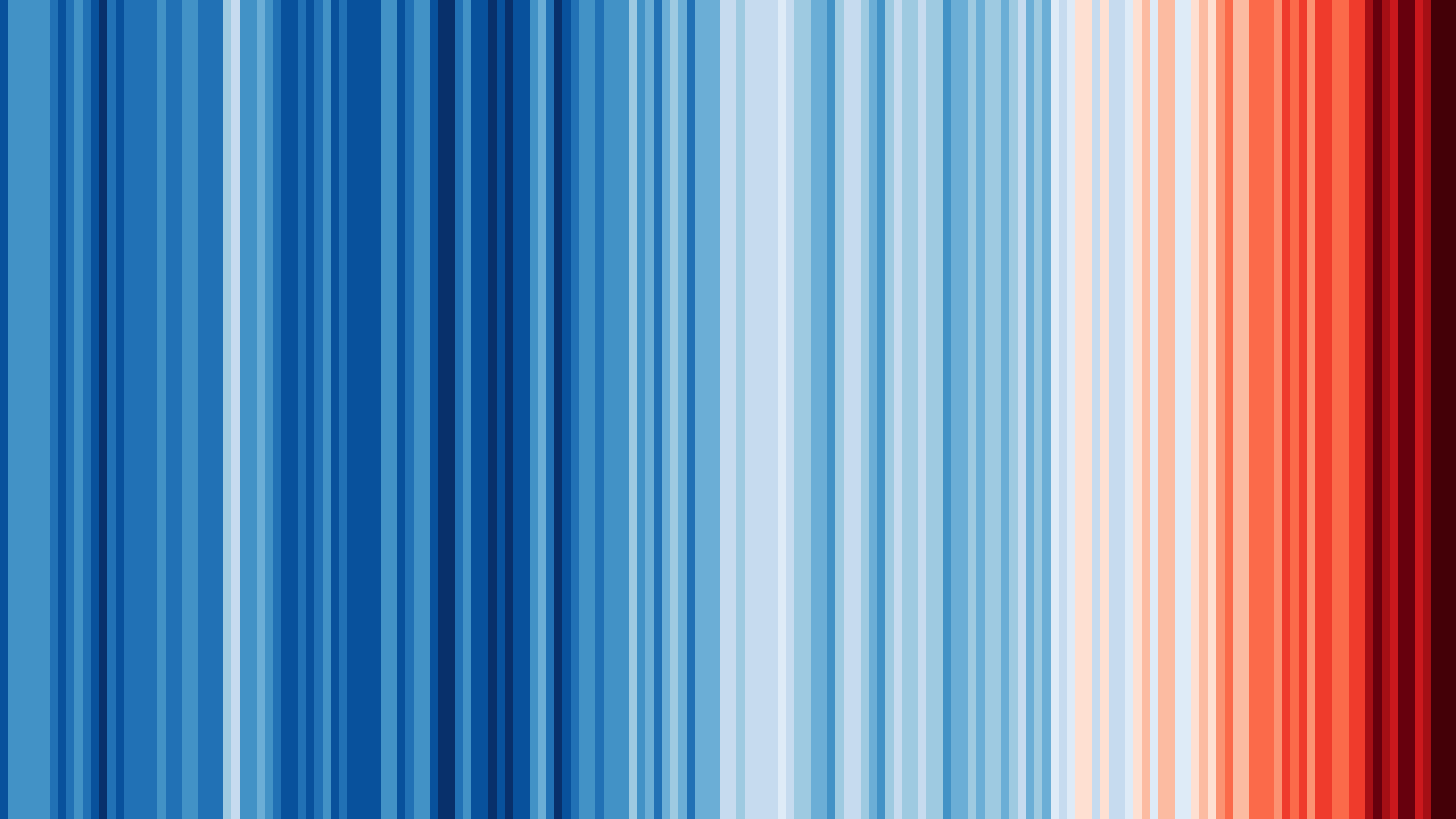
Each year, starting with ~1850, gets a column colored to reflect its average temperature and that’s it. We instinctively know that the X axis is usually used for time-based left-to-right scale, and we don’t need the distraction of actual numeric values for each entry — the colors do their job even better.
The purist approach accentuates the trend: since the turn of the century, the world has been steadily getting hotter.
Here’s how the exact same data looks like as a traditional chart:
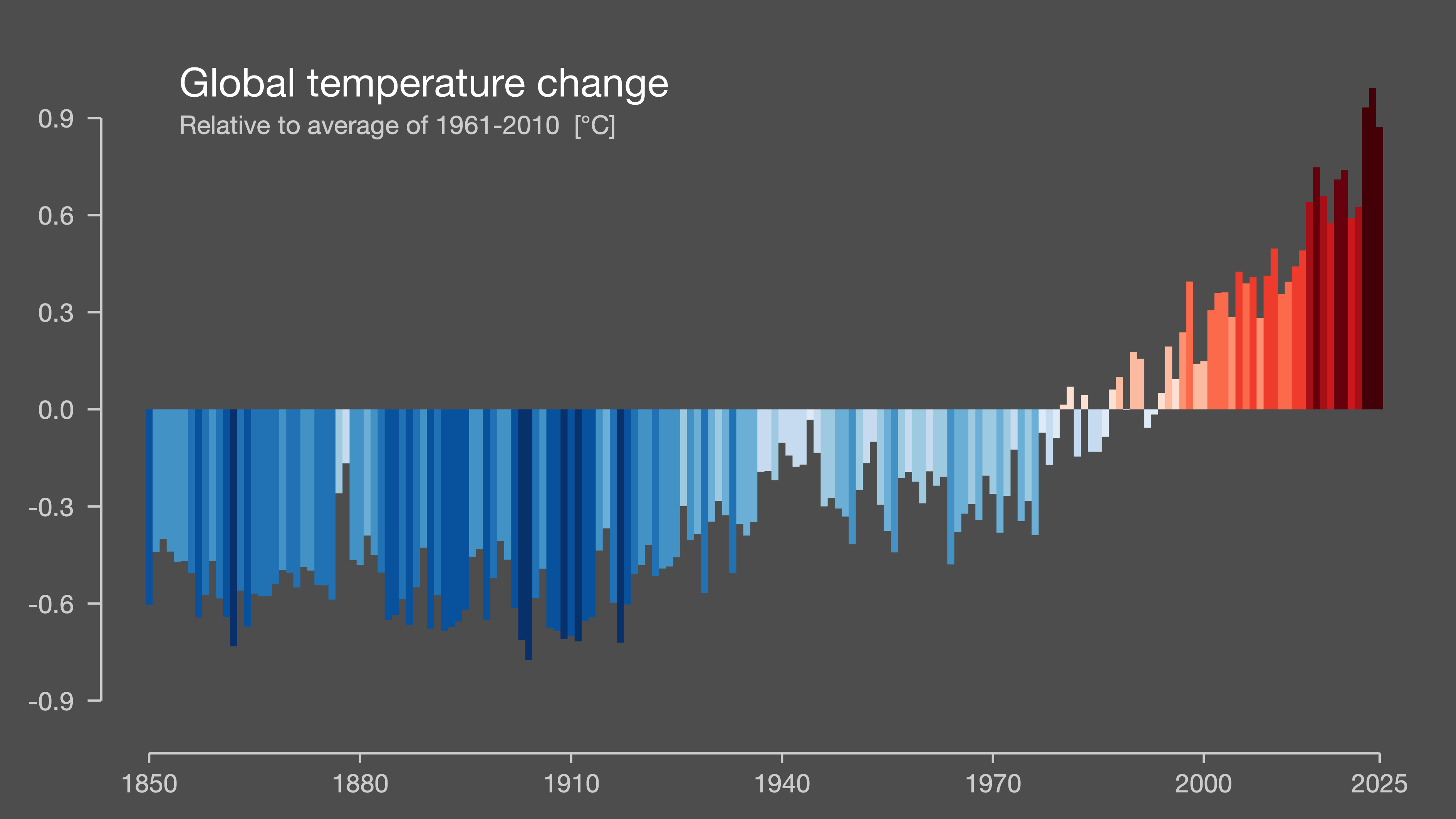
Same data. Same trend. Just mind-numbingly boooooooring.
The impact
It seems that decluttering the visualization was the exact right way to drive the message across — Ed Hawkins’ chart struck a cord with the World. The warming stripes have been:
Downloaded more than a million times from showyourstripes.info.
Put on the cover of the Economist, and used as the logo of a US congressional climate committee.
Worn on a Reading FC football kit (Hawkins’s local club) and printed inside Greta Thunberg’s The Climate Book.
Hung on the wall of the Museum of Modern Art.
Would the Warming Stripes made such a global impression if Ed Hawkins released it as the traditional bar chart above? Most certainly not — people respond to strong, distilled messages, not something that looks like it came from an Excel spreadsheet.
What came before
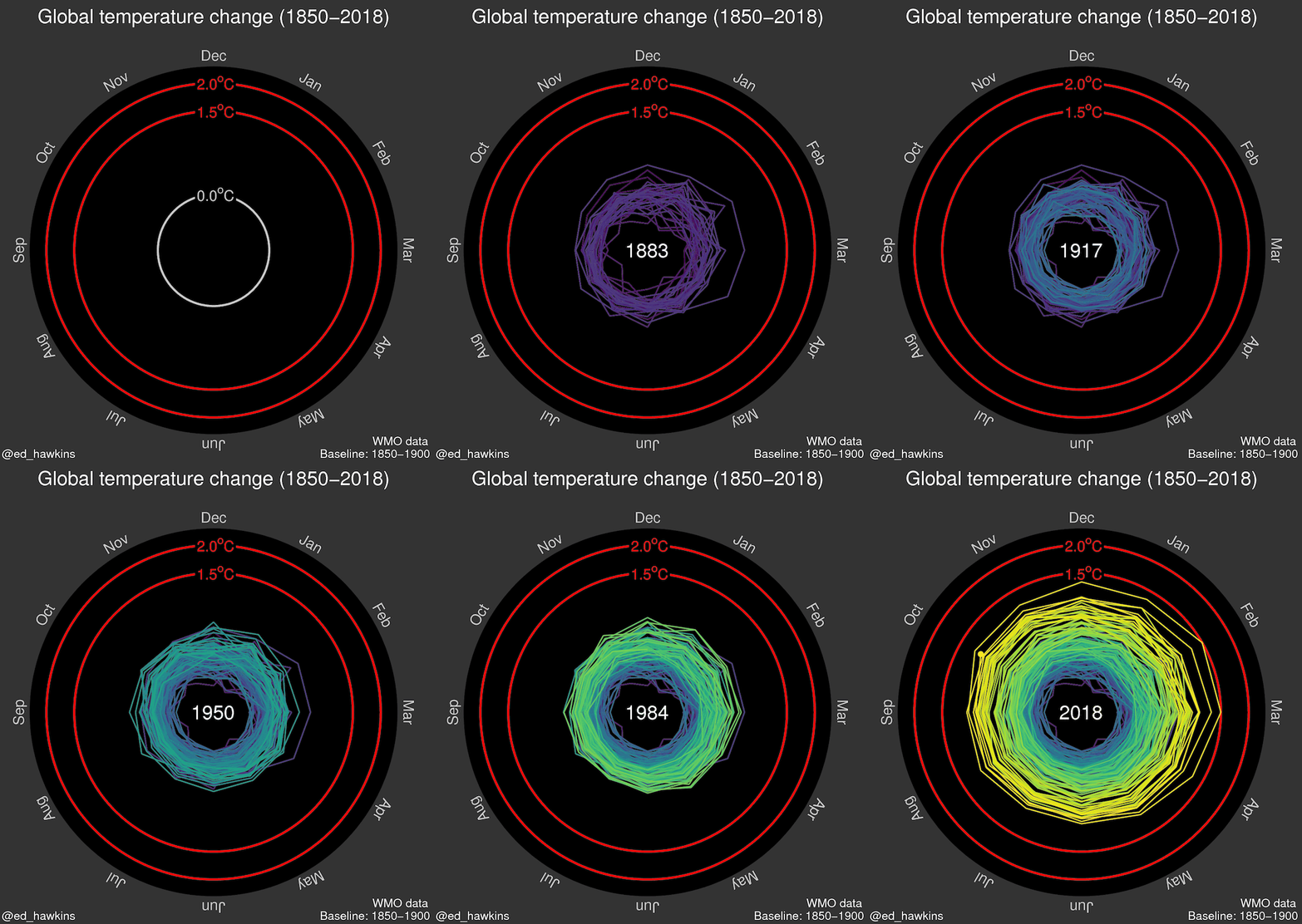
Before Warming Stripes in its latest form, Ed Hawkins released an animated “climate spiral,” which got an even bigger stage. A redrawn cut of it played during the 2016 Rio Olympics opening ceremony, in front of something like a billion people. Not bad for a scientist’s side project.
Try it yourself
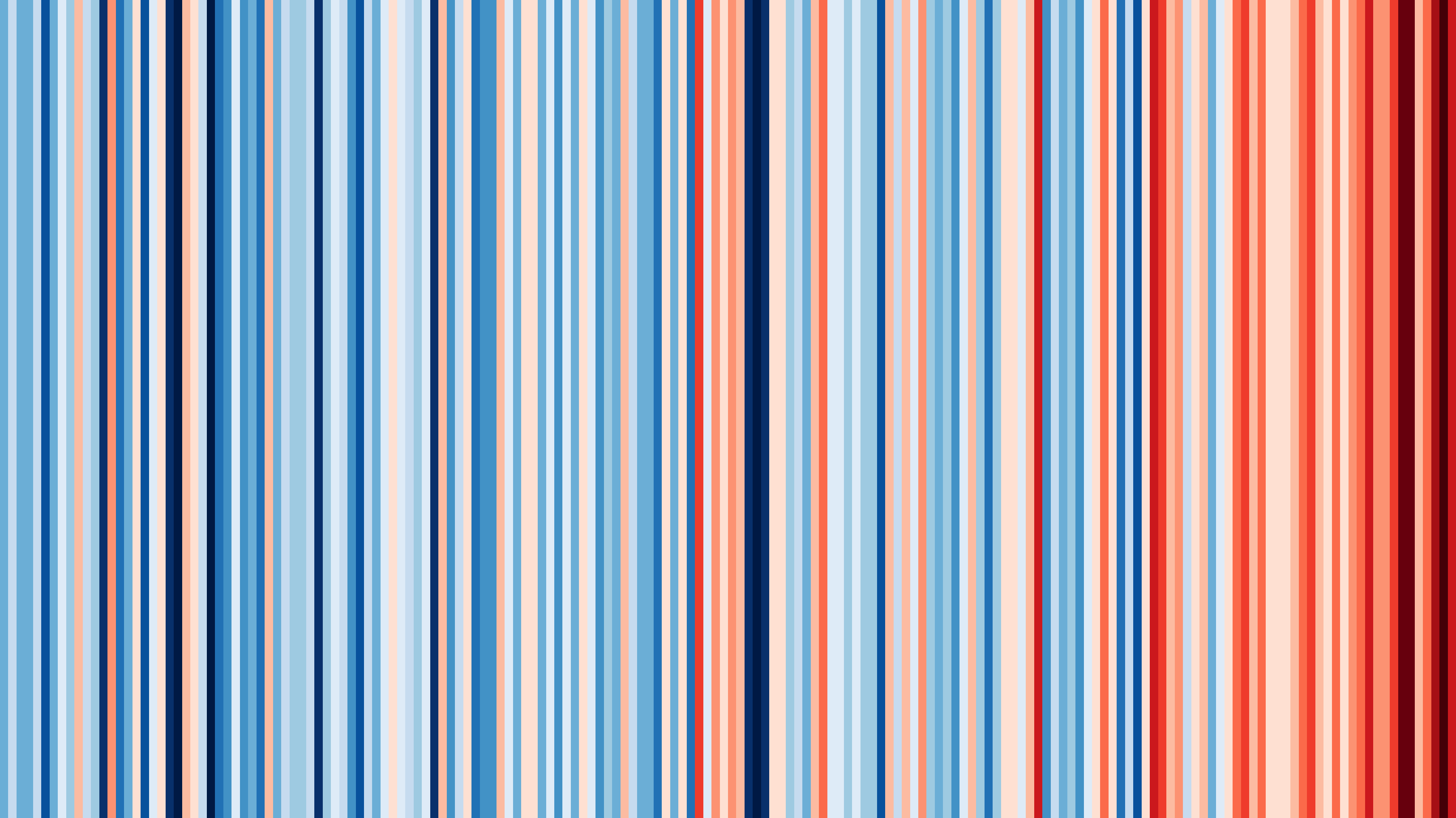
Head over to showyourstripes.info to generate warming stripes for your continent, country, or even individual city.
Turns out, the warming effect is a tad softer where I live (Vilnius), yet the tendency is still quite prominent:
DataViz Dojo was created by amCharts team. We’re not here to peddle you our data-viz lib. We’re here to have fun with facts, data, cartography, and history, blending it all into beautiful visual stories. Subscribe, follow, or simply check in regularly for more compelling stuff!