

The Brief Window
Total solar eclipses exist only because of a temporary cosmic accident. Most eclipse maps treat this as a binary — in the path or out. Here's one that doesn't.


An Accident of Geometry
The Sun is about 400 times wider than the Moon. It’s also about 400 times farther away. Both objects appear almost exactly the same size in our sky — which is why, when they align, the Moon can cover the Sun nearly perfectly and reveal the corona, the Sun’s outer atmosphere, otherwise invisible from Earth.
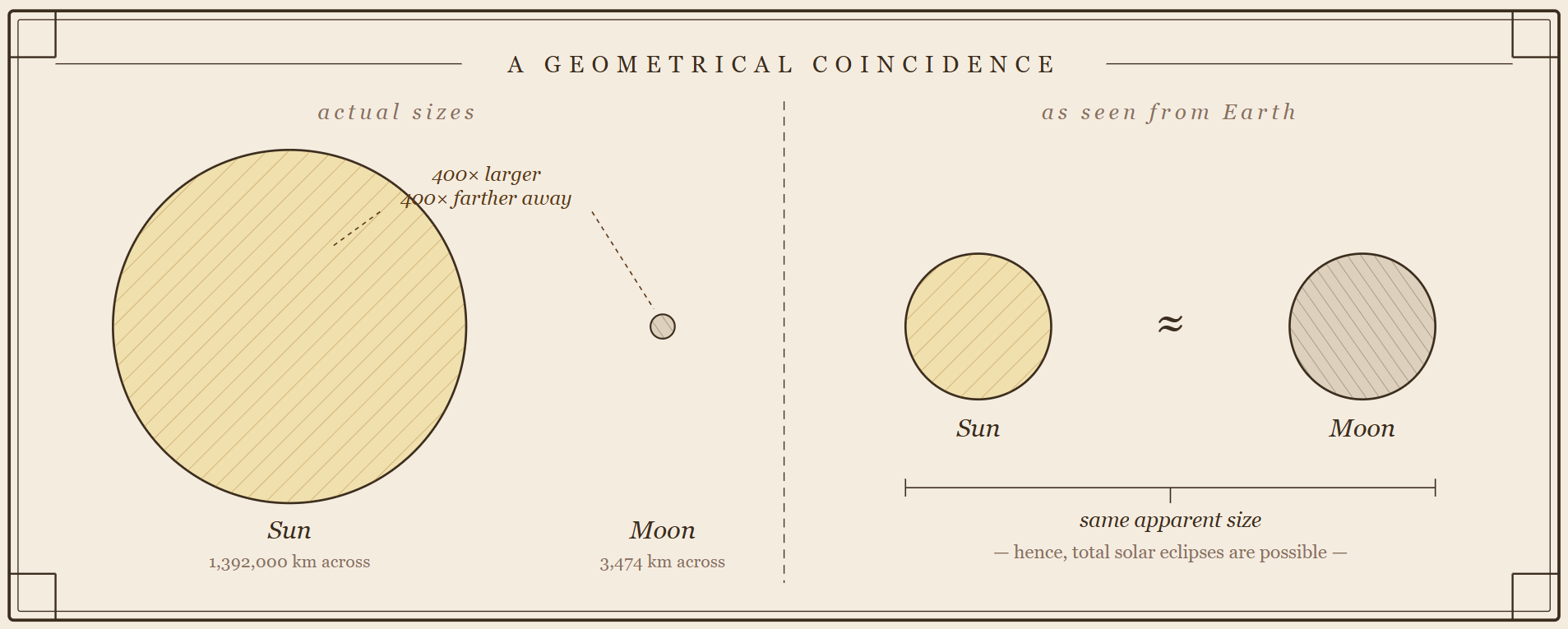
No law of physics requires this. It’s a coincidence — and a temporary one. The Moon drifts away from Earth at about 38 millimeters per year, pulled outward by tidal forces. In roughly 600 million years, it will appear too small to fully cover the Sun. Total solar eclipses will become geometrically impossible. Complex animal life has existed on Earth for about 600 million years — meaning we’ve been here for essentially the entire window. That feels like luck worth paying attention to.
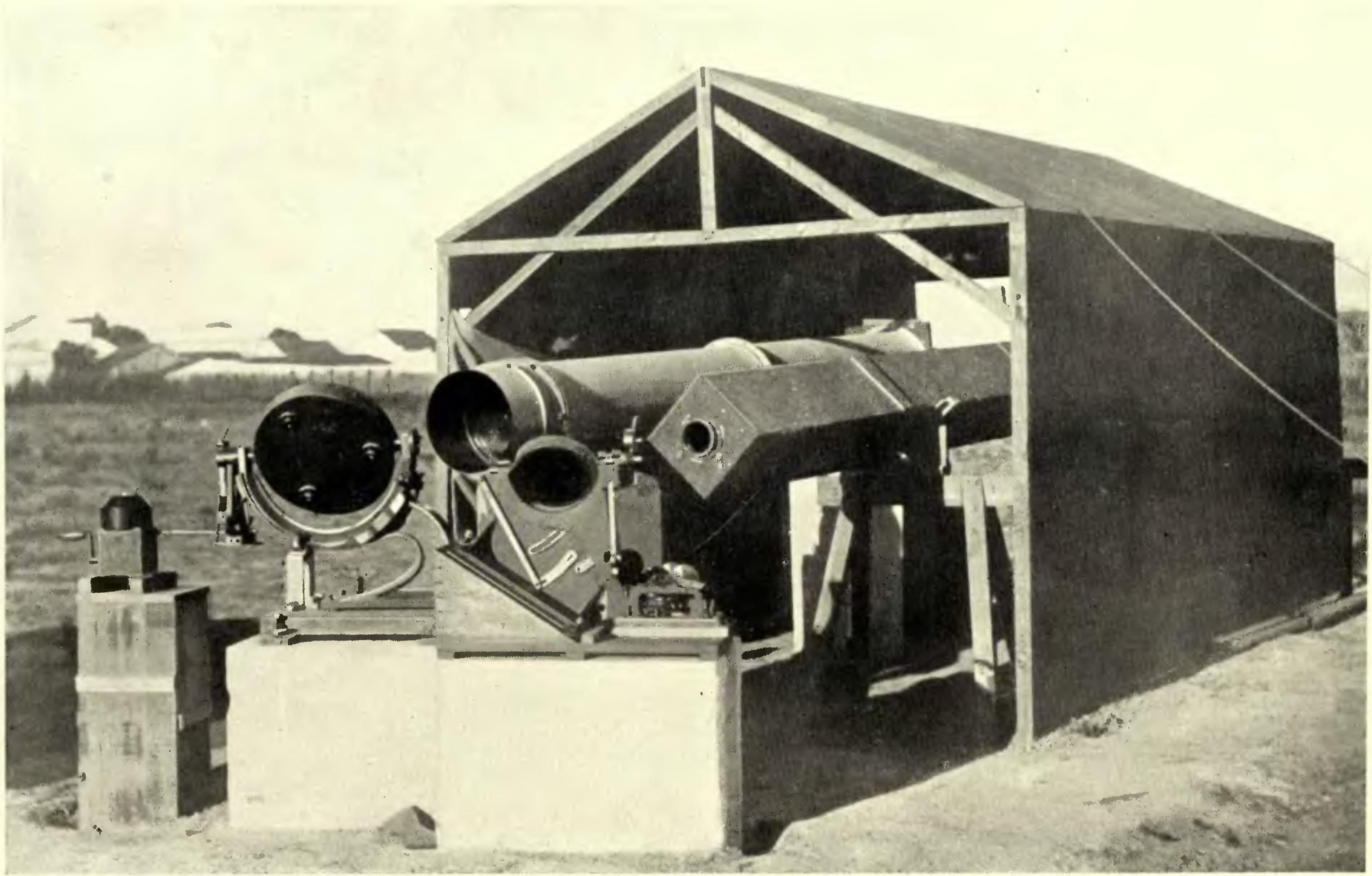
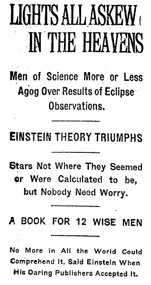
It’s also worth noting that this coincidence has been scientifically useful. In 1919, Arthur Eddington sailed to an island off the coast of Africa to photograph stars near the Sun during totality. Normally those stars are invisible, swamped by sunlight. The eclipse made the measurement possible. His photographs confirmed Einstein’s general relativity and turned a moderately well-known physicist into an international celebrity. The geometry of shadow has consequences.
The Visualization Problem
Any given location on Earth sees a total solar eclipse roughly once every 375 years. The 2024 eclipse over North America drew nearly 20 million travelers and generated an estimated $6 billion in economic activity. People care deeply about getting this right. And yet the maps available for planning have mostly been stuck in the same mode for decades: a corridor on a flat projection, maybe with a center line, maybe with a few city labels. In or out. That’s the whole story.
The problem is that “in or out” is not actually the question most people are asking. They’re asking: how much of the Sun will I see covered from where I’m standing, and at what time? That’s a continuous field, not a binary. And rendering it as a binary throws away most of the information.
Think of it like a topographic map that only shows whether terrain is above or below sea level. Technically accurate. Not very useful for planning a hike.
The Solar Eclipse Map

We built this because we didn’t want to miss another eclipse and couldn’t find anything that answered our actual questions. It opens in overview mode — all eclipses for a selectable date range on a globe, color-coded by type. The data runs from 1900 to 2100, from Fred Espenak’s Five Millennium Canon of Solar Eclipses. Click any band and the globe rotates to center on it.
Contours, Not Corridors
The key design decision was to render shadow coverage as contours rather than a single boundary. Like elevation lines on a topo map, the obscuration rings show exactly how the eclipse field varies across the landscape — 10%, 20%, 30%, all the way in to totality. The gradient from the outer edge to the center tells you far more than a corridor ever could.

There’s also a toggle between Path mode (static contour fills showing maximum coverage) and Shadow mode (live moving rings that update as you scrub through time). Path mode is for planning. Shadow mode shows the shadow as it actually moves — a fast-moving dark spot racing across the Earth at up to 1,770 km/h, surrounded by expanding penumbral rings.
Time as a Dimension
The time slider turns the eclipse from a static map into a queryable dataset. Scrub through it manually or hit play — 5 minutes of eclipse time per real second. The umbral shadow moves, the day/night terminator shifts, the Sun and Moon position markers track their actual computed positions. A 4-minute totality takes about 48 seconds to watch.
Point Query: Your Exact View
Most eclipse maps are broadcast visualizations — they show the whole picture and leave you to figure out your specific situation. The observer pin inverts that. Drop it anywhere on the map, and the tool becomes a point query: what is the exact sun coverage at these coordinates, right now, at this moment in the eclipse? Drag it somewhere else and the answer updates instantly.

The pin shows current coverage, peak coverage for that location over the full eclipse, and local time with automatic timezone lookup. The diagram in the top right renders the actual sun/moon geometry from that observer’s perspective — not an icon, a live computed view. If you’re asking “should I drive 40 miles north,” this answers it precisely.
Cities, Export, and Sharing
Toggle the cities layer and you get populated places along the center line, sized by population — useful for quickly finding where to go, or confirming you’re already there. The export options include a PNG screenshot and video recording in several formats (1920×1080 down to 1080×1080 square), which captures the actual computed shadow sequence frame by frame.
Every interaction — eclipse, time position, observer pin location, visible layers, map rotation, zoom — is encoded in the URL. Share the link and it opens to exactly that view.
What’s Next
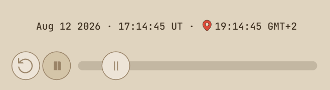
The next few years are good ones if you’re willing to travel. August 12, 2026 — total eclipse over the Iberian Peninsula, Mallorca, North Africa. August 2, 2027 — the longest total eclipse of the 21st century, 6 minutes 23 seconds maximum, crossing the Sahara and Egypt. July 22, 2028 — Australia, up to 5 minutes 10 seconds across the Northern Territory and Queensland.
For North Americans who missed 2024: August 23, 2044 clips Montana and the Dakotas near sunset (90 seconds), then August 12, 2045 crosses California to Florida with up to 6 minutes in parts of Florida. The 2045 one is the one worth planning for.
The Moon is moving away from us at 38 millimeters a year. In 600 million years the geometry stops working. We’re in the window. Use it.
Plan your next eclipse
Full catalog 1900–2100. Shadow contours, live playback, observer pin, video export.
DataViz Dojo was created by amCharts team. But we aren’t here to peddle you our data-viz lib. We’re here to have fun with facts, data, cartography, and history, blending it all into beautiful visual stories. Subscribe, follow, or simply check in regularly for more compelling stuff!
 | A guest post by
|