

Sankey Diagrams Weren't Invented by Sankey
Harness did it first. Minard made it famous. Sankey came last and got his name on it. Here's the full story — and what amCharts just made possible.


A Quick History Lesson That Will Mildly Annoy You
Here’s something that bugs me about data visualization history: Sankey diagrams weren’t invented by Sankey. Captain Matthew Henry Phineas Riall Sankey — yes, that was his full name — created his famous steam engine efficiency diagram in 1898. It showed where energy was being lost in the system, with band widths proportional to the amount of energy flowing through each stage. People loved it, the name stuck, and here we are.
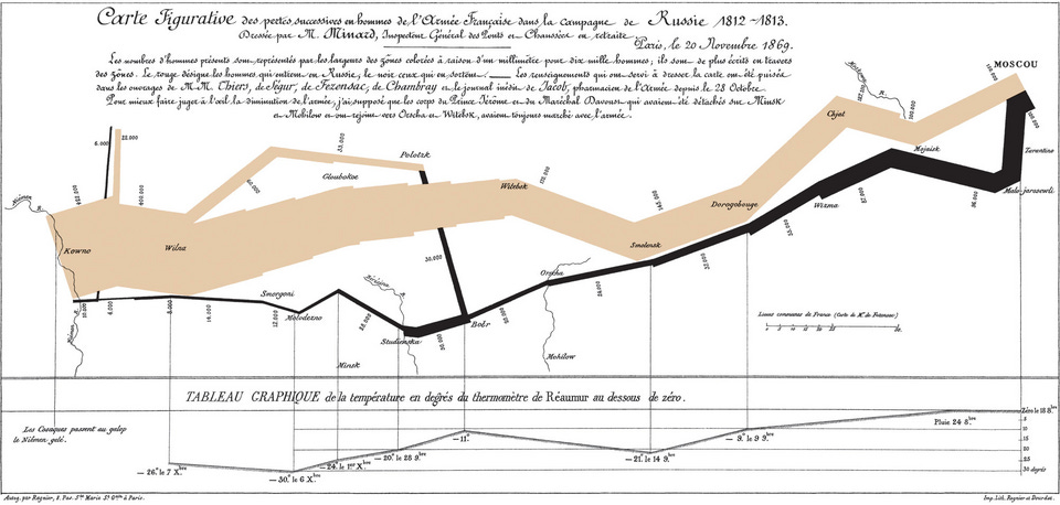
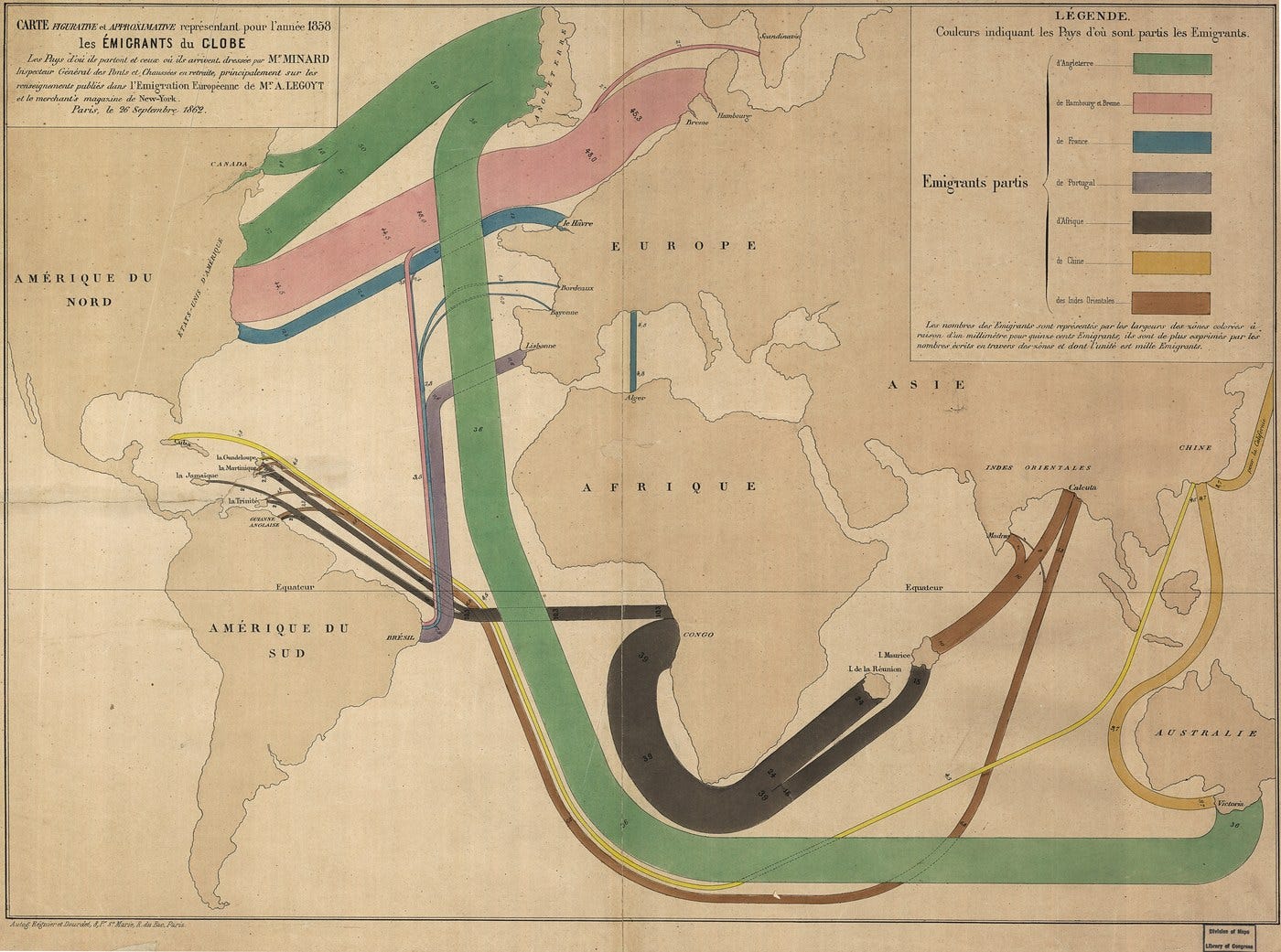
The person most people credit as the actual inventor is Charles Joseph Minard, the French civil engineer who was doing the same thing in the 1840s — fifty years before Sankey, on actual geographic maps. We talked about him before when we recreated his famous Napoleon’s 1812 retreat map — the one Edward Tufte called “the best statistical graphic ever drawn.”
But here’s the part that even most dataviz people don’t know: Minard wasn’t first either.
Enter Henry Drury Harness
In 1837, a British Army lieutenant named Henry Drury Harness was assigned to the Irish Railway Commission, tasked with figuring out where railways should be built across Ireland. To answer that question, he needed to map where people and goods were already moving — and he needed to show how much was moving, not just where.
So he invented something new: maps where the width of each line was drawn proportional to the volume of traffic it represented. Thick bands for busy routes, thin lines for quiet ones. The maps were published in the Commission’s report in 1838 — seven years before Minard’s first flow map, and sixty-one years before Sankey’s famous diagram.
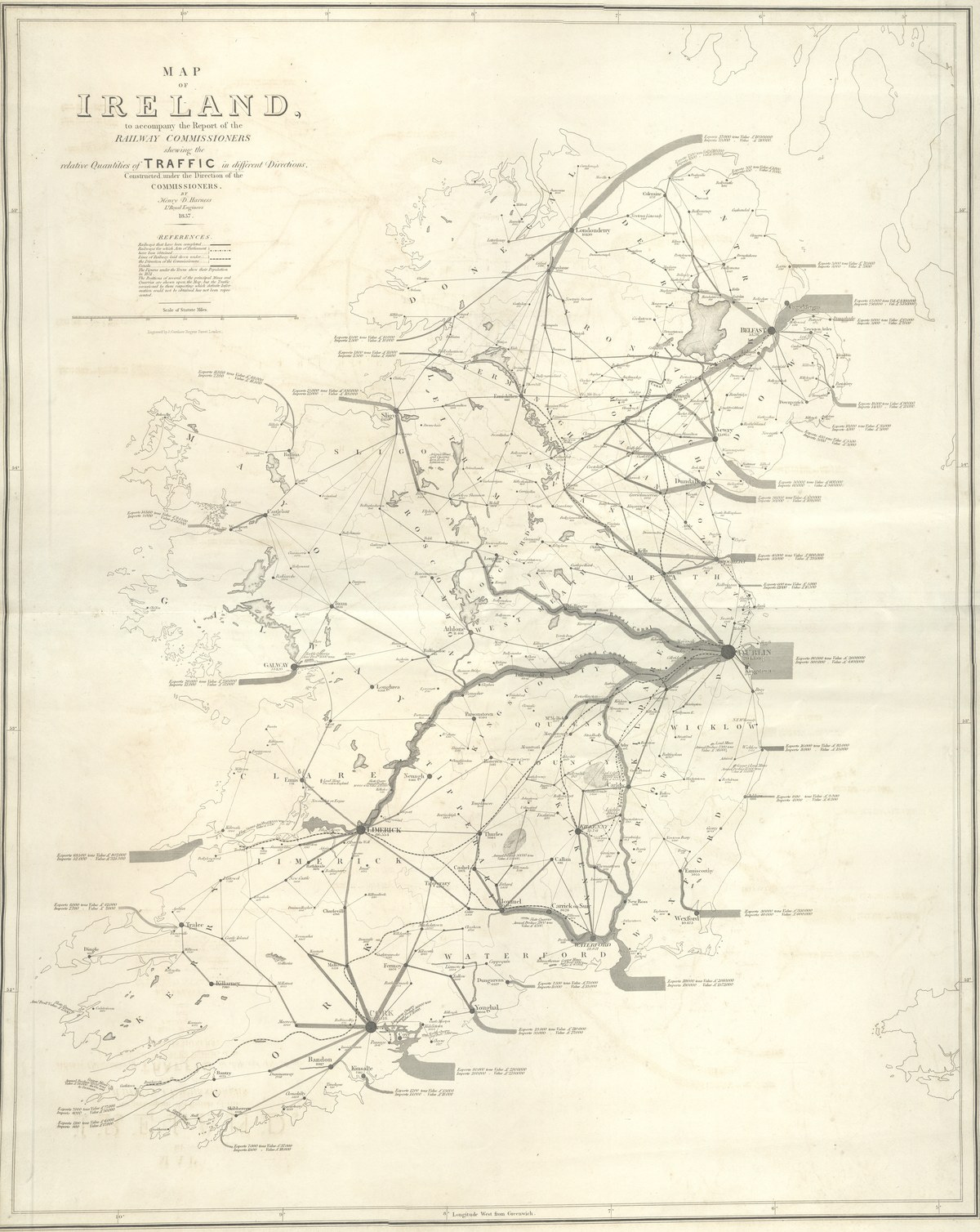
Besides this remarkable piece of work, Harness also invented graduated circles for showing city populations, figured out how to show urban and rural populations on the same map, and pioneered choropleth shading for population density — all in the same atlas. Then, for nearly 120 years, almost nobody noticed. The cartographic historian Arthur Robinson called them “one of the more remarkable sets of maps ever made.” (his 1955 article in The Geographical Journal was the first serious academic treatment of Harness’s contribution.)
This is what’s sometimes called Stigler’s Law of Eponymy: scientific discoveries are almost never named after their actual discoverers. (Stigler himself attributed the law to the sociologist Robert Merton, making it a self-demonstrating theorem, which is maybe the most elegant thing in the history of science.) In this case the law applies with unusual force: three separate inventors, spread across sixty years, and the name went to the last one.
Anyway. Minard. Whether Minard knew of Harness’s work or arrived at the same idea independently isn’t known for certain. What is known is that he took it further than anyone: 51 flow maps over his career, each grounded to the geography it was about, so you could see the actual physical paths things took through the world.
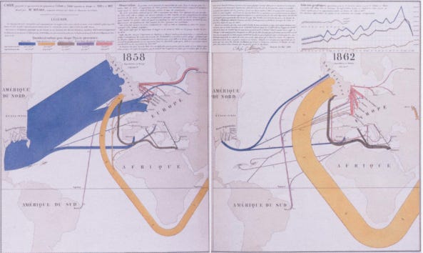
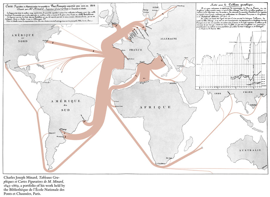
His 1864 map of cotton imports into Europe, for example, traces flows from the American South, Egypt, and India into British and continental ports. His wine export maps show where French wine was shipped by sea — all the way to the Americas, Africa, and Australia. His migration maps show people moving between countries as bands, thicker where more people went. These weren’t just abstract Sankey charts — they were Sankey charts grounded to a map, so you could see the actual physical paths things took through the world.
And then, for about 150 years, this idea kind of sat there. You could make a regular Sankey chart in any charting library. You could put dots on a map. But actually combining the two — proportional flow bands that respect geography, follow real routes, animate, and work on a globe — that was surprisingly hard to pull off in an interactive, web-friendly way.
Until now.
amCharts Just Introduced Map Sankey
amCharts just released MapSankeySeries — a new chart series type for the amCharts 5: Maps library that does exactly what Minard was sketching by hand in the 1860s, but interactive, animated, and built into the same maps library you might already be using.
The core idea: you define a set of flows (origin, destination, value), and the library draws curved bands between those points on the map. Band width is proportional to the value, just like a regular Sankey. But because it’s on a map, the bands follow the actual geography — they pan and zoom with the map, they curve correctly in different projections, and if you’re using a globe, they wrap around it properly.
It’s part of amCharts 5: Maps, so — no extra licensing needed.
The Demos Are Where It Gets Fun
Provided you haven’t been taking a vacation from this world under some rock, you’ve no doubt heard about the Strait of Hormuz. Yes, that narrow sliver of water that acts as a bottleneck for the good chunk of the planet’s oil trade.
The oil flow demo is the one that really shows what waypoints can do. It maps crude oil exports out of the Persian Gulf — Saudi Arabia, Iraq, UAE, Kuwait, Iran, Qatar — all flowing out through the Strait of Hormuz and then splitting off to refineries in Asia and Europe. The flows route through actual maritime channels: through the Strait, across the Arabian Sea, through the Malacca Strait, up to East Asia, or west through the Suez Canal to Europe.

Interactive demo: Oil Export Flows with Waypoints »
The coffee one is a bit more fun for everyday context — it traces the global coffee supply chain from growing regions to consuming countries. Which is a nice way to think about your morning cup: it probably crossed at least two oceans to get to you.
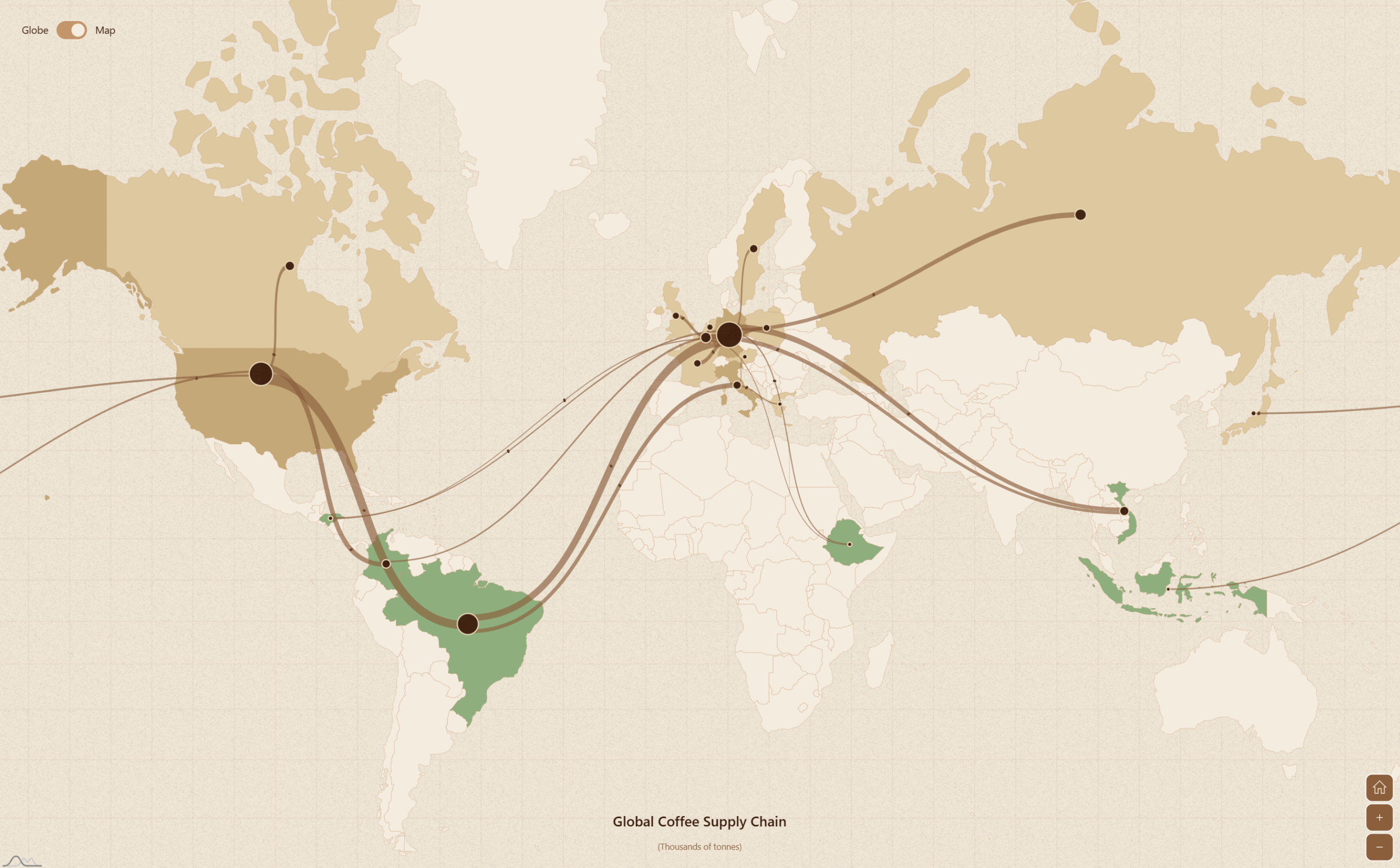
Interactive demo: Coffee Sankey Map »
What Can You Actually Build With This?
Anytime you have data that’s about things moving between places, and the volume of that movement matters, this is the chart type you want. Some obvious ones:
Trade flows — imports and exports between countries or regions
Migration — where people are moving to and from
Supply chains — where components are sourced and where products ship
Energy grids — electricity generation and distribution across a region
Flight routes — passenger volumes between hubs
Financial flows — investment or remittance patterns between countries
The thing that makes it more useful than a regular Sankey is that your audience immediately understands the geography without having to think about it. If you’re visualizing shipping routes, the map tells half the story before anyone reads a label.
Getting Started
The basic setup is pretty minimal. You add a MapSankeySeries to an existing map chart and feed it nodes (the locations) and links (the flows between them). Locations can be specified as ISO country codes, latitude/longitude pairs, or a mix:
var sankeySeries = chart.series.push(
  am5map.MapSankeySeries.new(root, {
    sourceIdField: "from",
    targetIdField: "to",
    valueField: "value"
  })
);

sankeySeries.nodes.data.setAll([
  { id: "SA", title: "Saudi Arabia" },
  { id: "CN", title: "China" },
  // ...
]);

sankeySeries.links.data.setAll([
  { from: "SA", to: "CN", value: 1800 },
  // ...
]);
Waypoints are added per-link, as an array of lat/lon coordinates that the band should route through. The full documentation covers all the options — coloring modes, particle animation speed, node shapes, and so on.
Minard Would Have Loved This
The reason Minard’s Napoleon map is so celebrated isn’t just that it packs six variables into one chart. It’s that you feel the retreat. It’s not just informative — it’s affecting. The geography carries emotional weight that a table of numbers never could.
That’s what ultimate goal of good data visualization is — tell a compelling story.
Minard got there first. His name just didn’t stick to it. But the idea was always right, and now it’s a lot easier to pull off.
DataViz Dojo was created by amCharts team. We’re not here to peddle you our data-viz lib. We’re here to have fun with facts, data, cartography, and history, blending it all into beautiful visual stories. Subscribe, follow, or simply check in regularly for more compelling stuff!
 | A guest post by
|
 | A guest post by
|