


Howdy, fellow data-vizards!
Here’s the second stab at our “roundup” newsletter format — slightly different (and late) than we originally planned, but non worse for it.
Let’s start with some of the stuff we’ve posted since we reached out last.
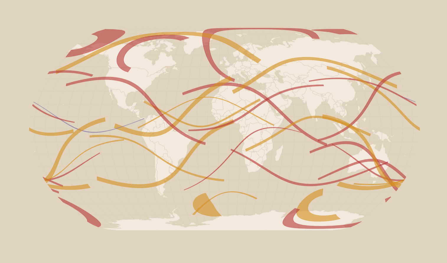
An Accident of Geometry
In this piece, we took you through a bit of a fascinating science history that involved curious fact about solar eclipses and a moment that propelled Albert Einstein to fame. We also introduced to a useful online tool that you can use and plan your next eclipse viewing right now.


Intersection of Data and Art (on a State Level)
There are so many ways to present data, but only some are worthy a place on your wall. In this article we looked at some of the most innovative stabs at data-viz art.


The Most Plotted Map Location — Null Island
Yes, you’ve seen markers plopped in the Atlantic, in the middle of that watery nook hugged by Africa. But have you heard of the Null Island?

In other news…
Let’s see what we in the DataViz Dojo have been up to.
New quake monitor tool

Visualize years of historical and recent earthquake data, filtered by magnitude, animated on an interactive map showing fault lines.
///
SVG Map Generator adds label support

The SVG Map Generator — a free online tool that you can use to generate a vector version of virtually any map, in multiple projections, coloring, and detail level — now supports labels! Turn them on, set color, size or make them fit into the target area.
///
New demo: Fun with sauna session biometrics

A fun way to plot your next visit to the sweat-room.
DataViz Dojo was created by amCharts team. We’re not here to peddle you our data-viz lib. We’re here to have fun with facts, data, cartography, and history, blending it all into beautiful visual stories. Subscribe, follow, or simply check in regularly for more compelling stuff!