


In this issue, we’ve collected a few data-viz-related articles we’ve posted since the last Roundup.
There’s also some news about recently churned out version 5.20, which adds new themes, patterns, and a few cool features as well as other goodies for amCharts powerusers.
Purified Data Speaks Louder

How stripping all the attributes of the chart can make the underlying data pattern stand out and even become a symbol.

Mapping Soil by Sheep

We put a crazy mapping theory from Neal Stephenson's Cryptonomicon to the data test. It checks out, but in a different way than the protagonist intended.
The Salamander That Keeps Chewing Up the Maps

A cartoon from 1812 gave the world a word for redrawing electoral districts. Two centuries on, the redrawing has become so mainstream it’s now a full-on headache for mapmakers.
In other (amCharts) news
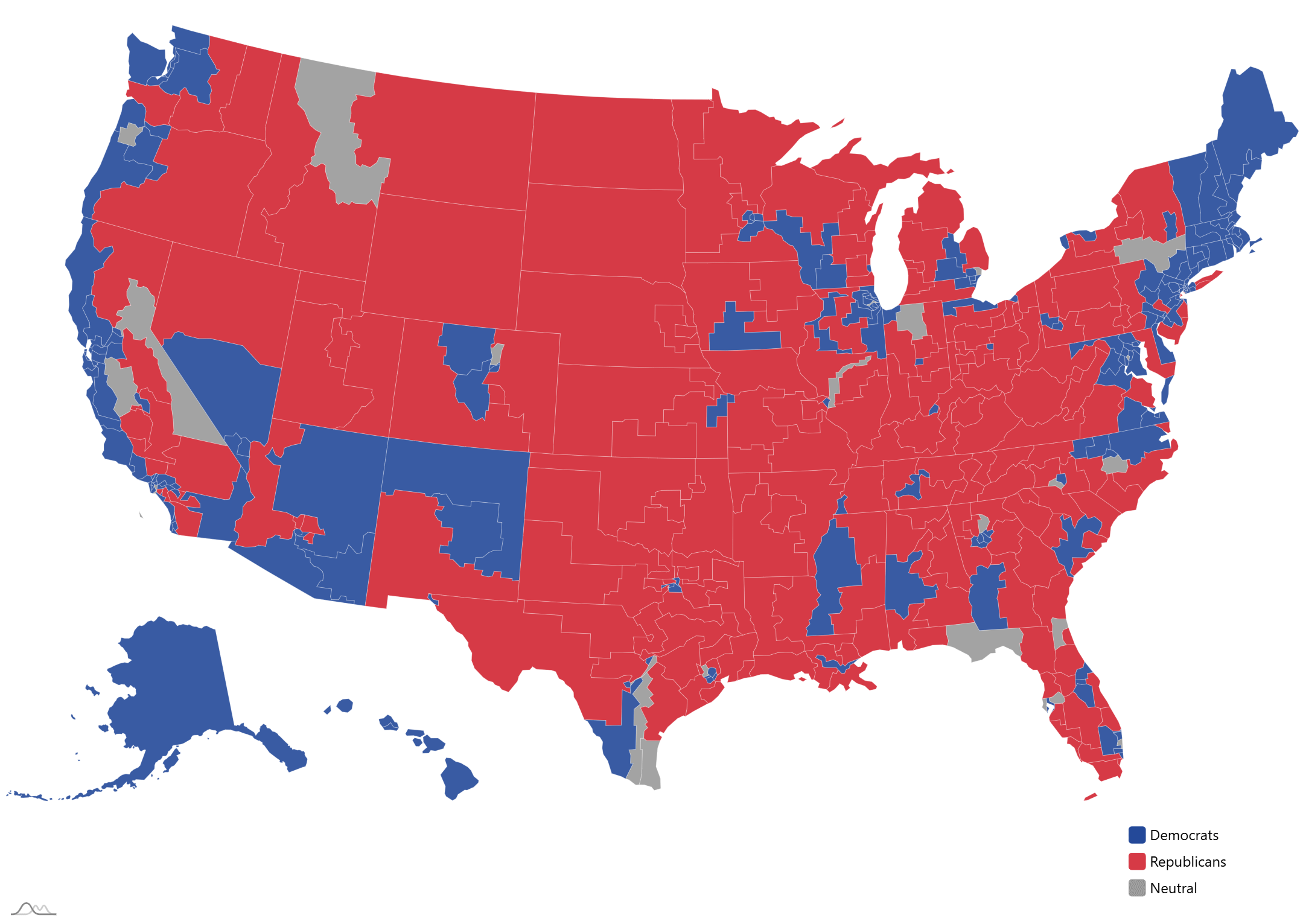
120th Congress maps
All the mid-term redistricting efforts are making electoral data-viz efforts difficult. That’s why we’ve went ahead and created an package of the Congressional districts maps for those states that are pretty much a “done deal”.
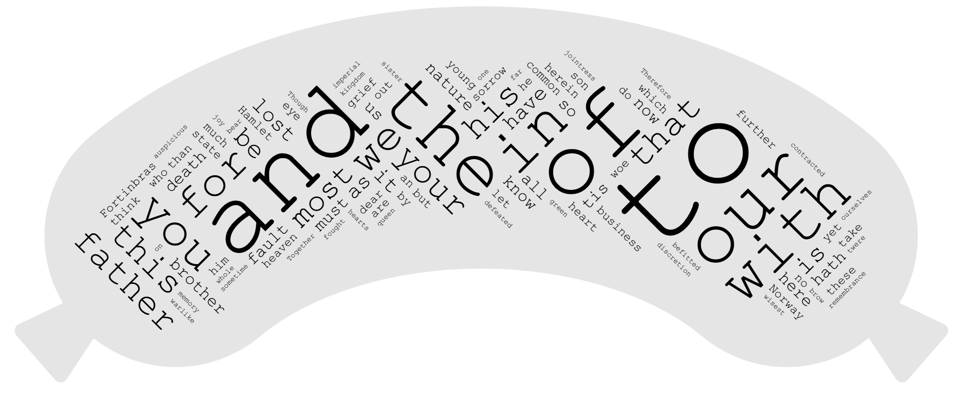
A fundamentally better Wordcloud
The Wordcloud chart in amCharts 5.20 got dramatically better:
It’s now super fast. So fast in fact, that we had to add a setting to slow it down. Yes, really.
It can now arrange words at ANY angle, and…
… take ANY shape.
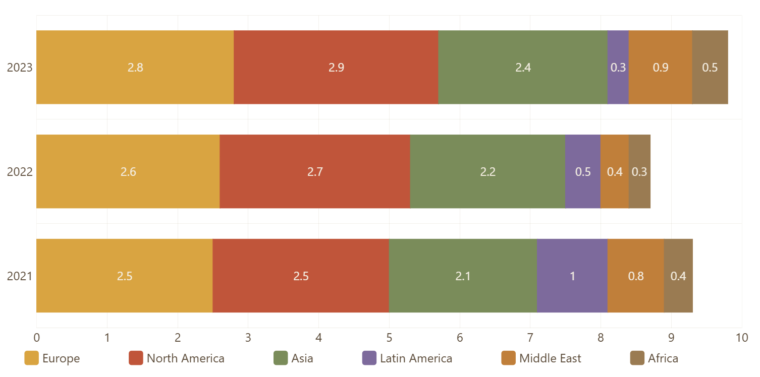
A bunch of new exciting themes
Our theme department was busy lately:
8 brand new palette themes.
Dark versions for all existing themes.
Two configurable factory themes: Monochrome and Adaptive.
And a couple of new patterns
Stars and Triangles.
A true hosted amCharts MCP server
We now run a fully hosted amCharrts MCP server so you don’t have to. Just point your favorite AI agent to this URL:
https://mcp.amcharts.com/mcpDataViz Dojo was created by amCharts team. We’re not here to peddle you our data-viz lib. We’re here to have fun with facts, data, cartography, and history, blending it all into beautiful visual stories. Subscribe, follow, or simply check in regularly for more compelling stuff!